.PT
INTRO
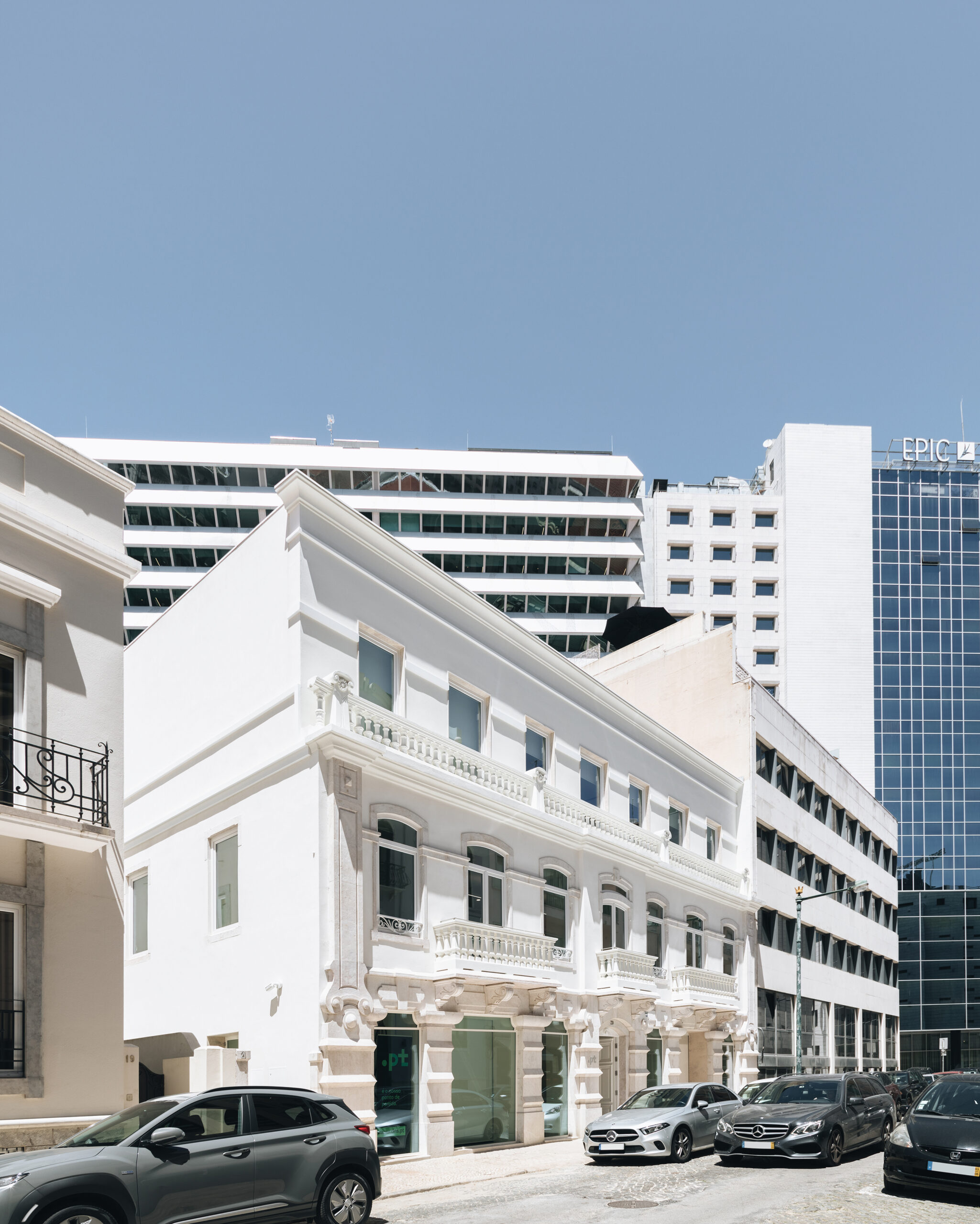
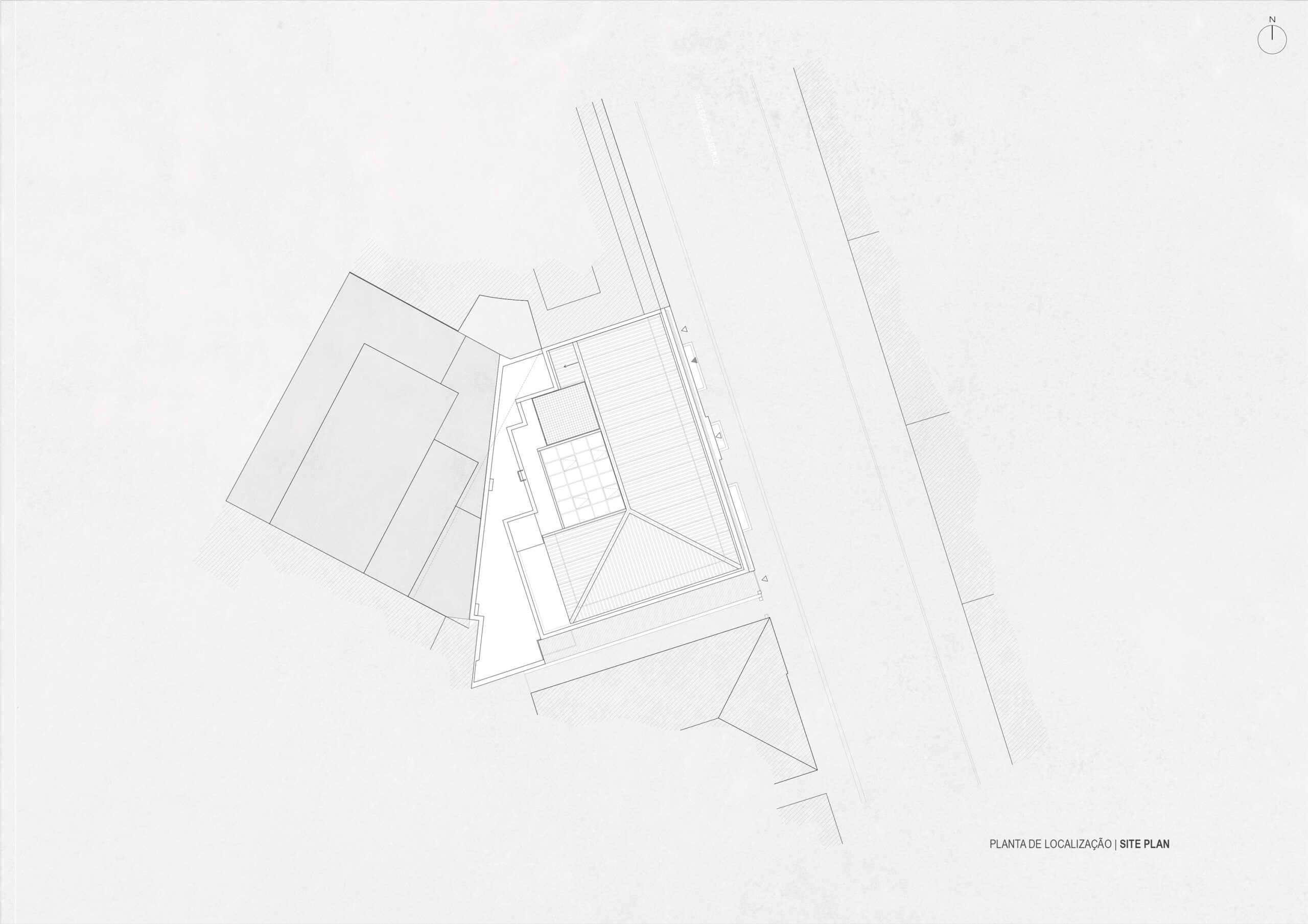
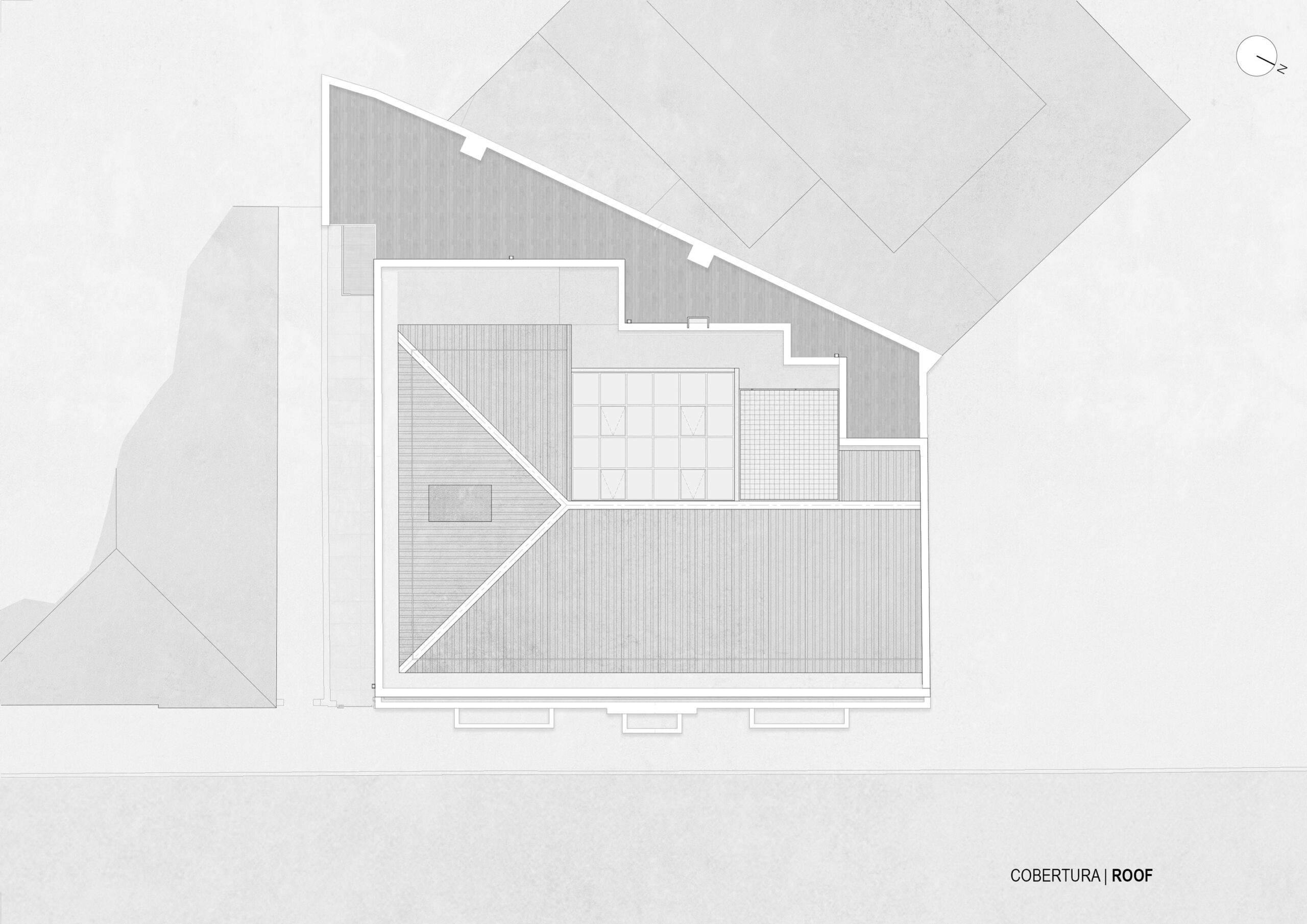
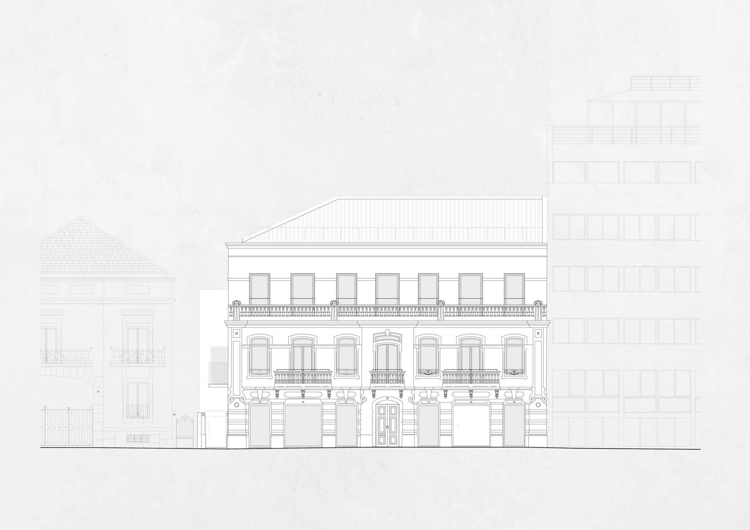
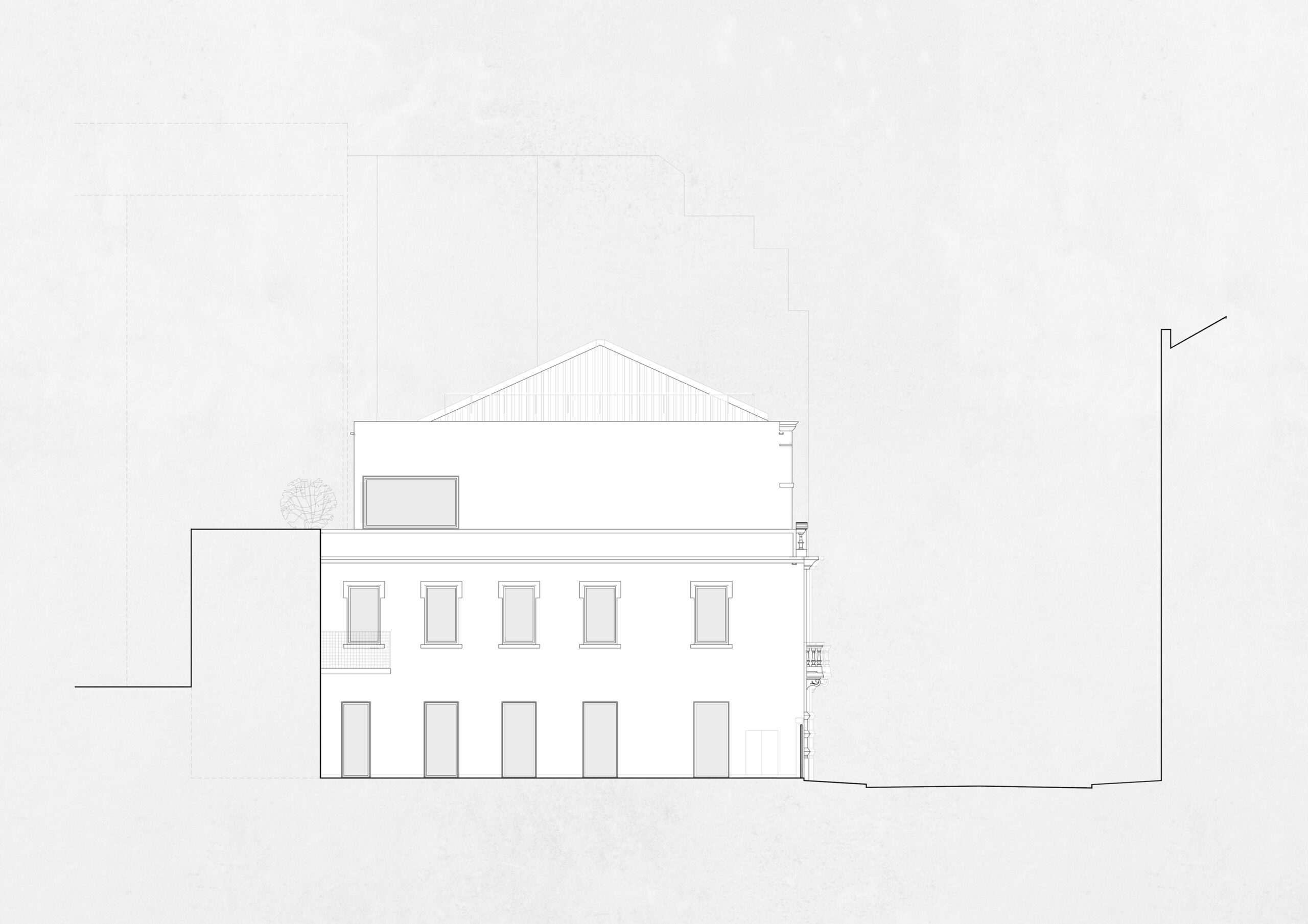
The project .PT is a refurbishment and expansion of an existing building with preservation of the facade located in Marquês de Pombal, Lisbon. The aim is to reorganize the interior and increase the number of floors to three.
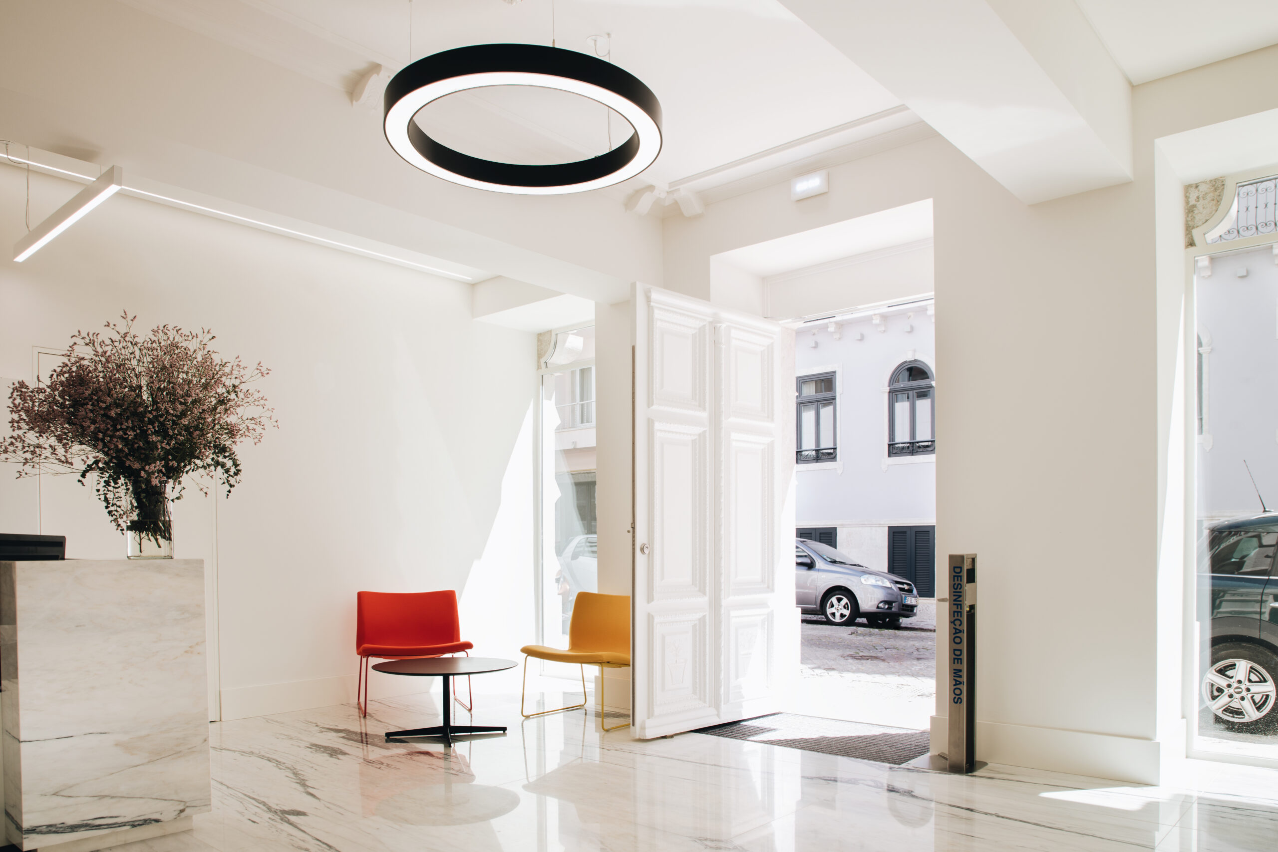
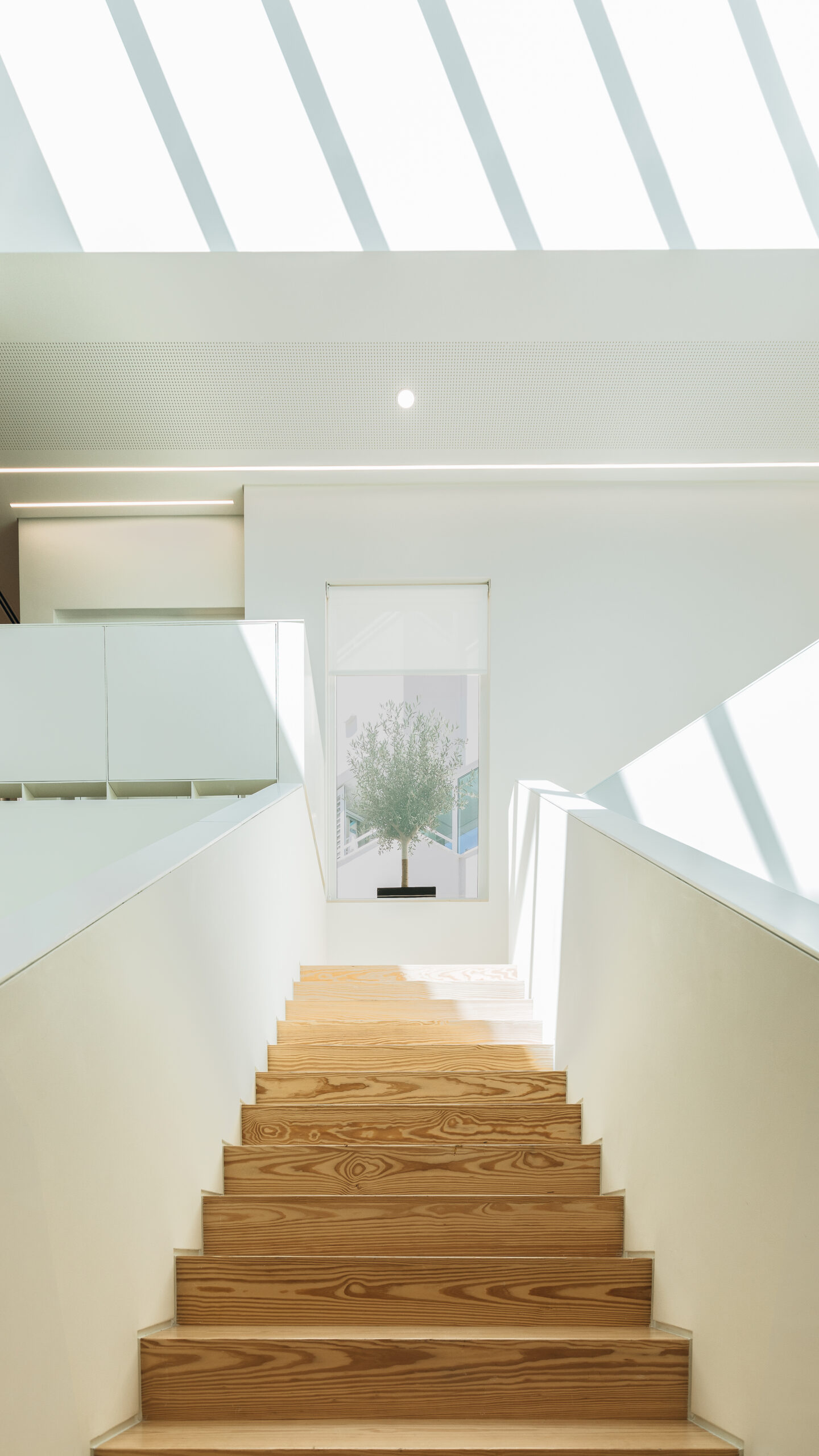
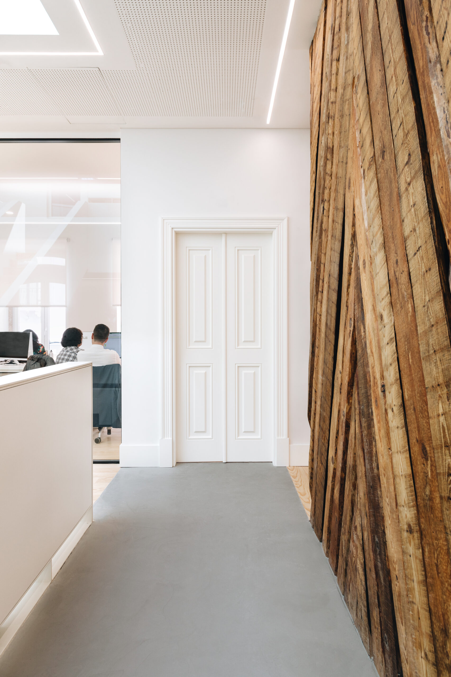
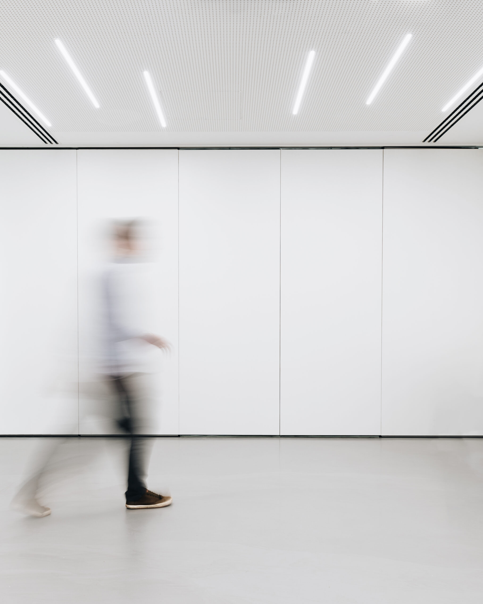
The project's concept is to embrace the coexistence and connection between two different temporalities. It aims to explore the "history" of the building in the context of a dialogue with a contemporary intervention, consistent with activities related to new technologies. The project also focuses on working with light as a raw material of architecture, revealing the sculptural plasticity of interior spaces and serving as a unifying element.
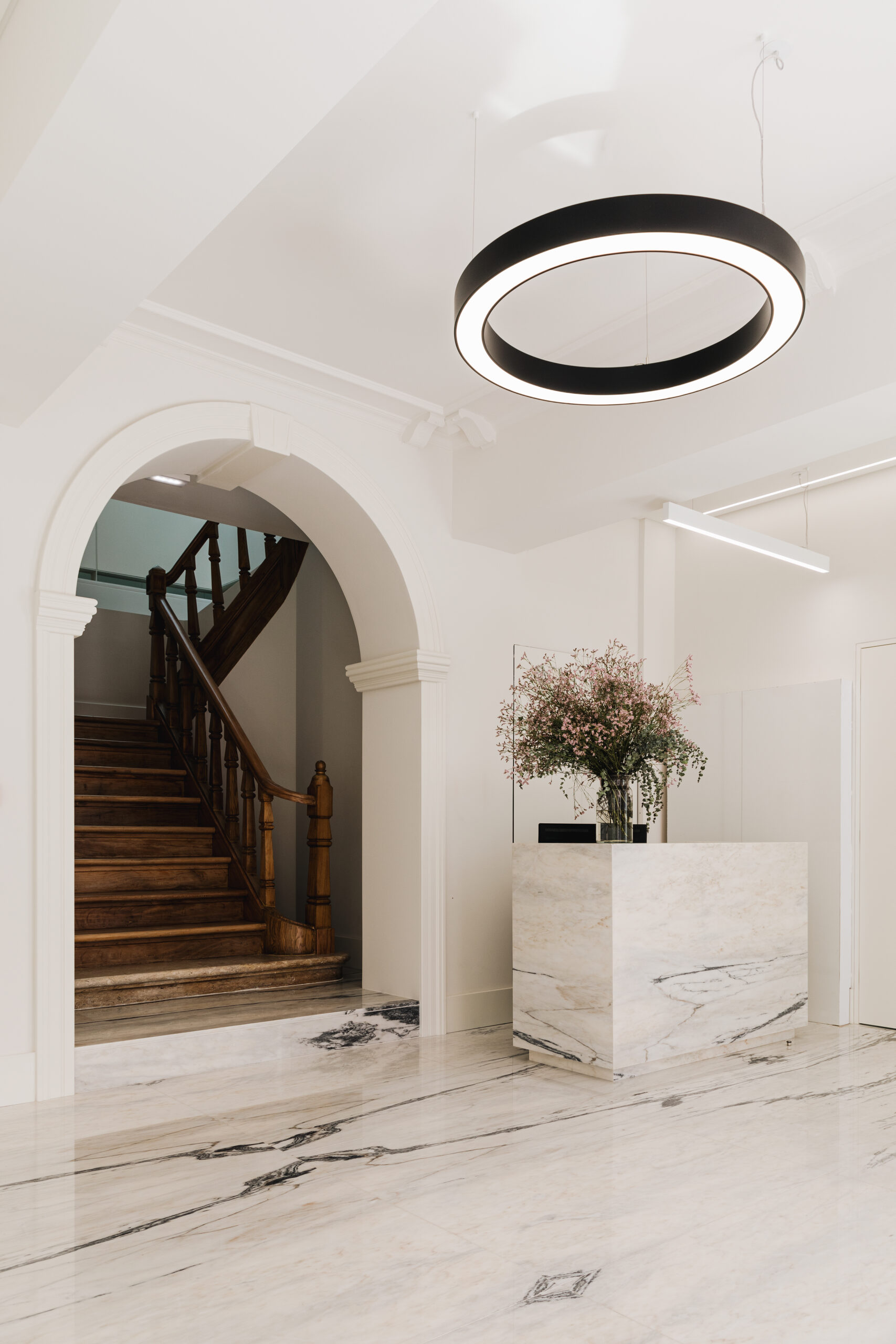
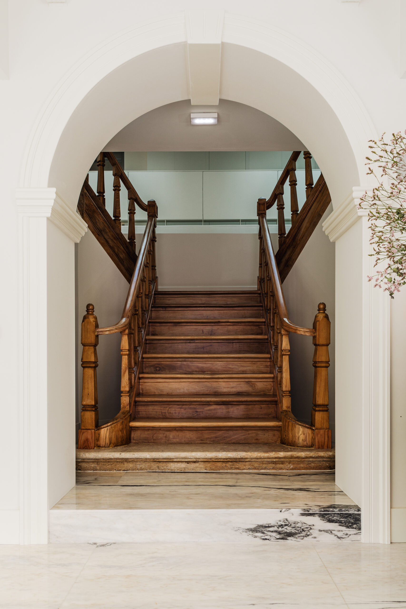
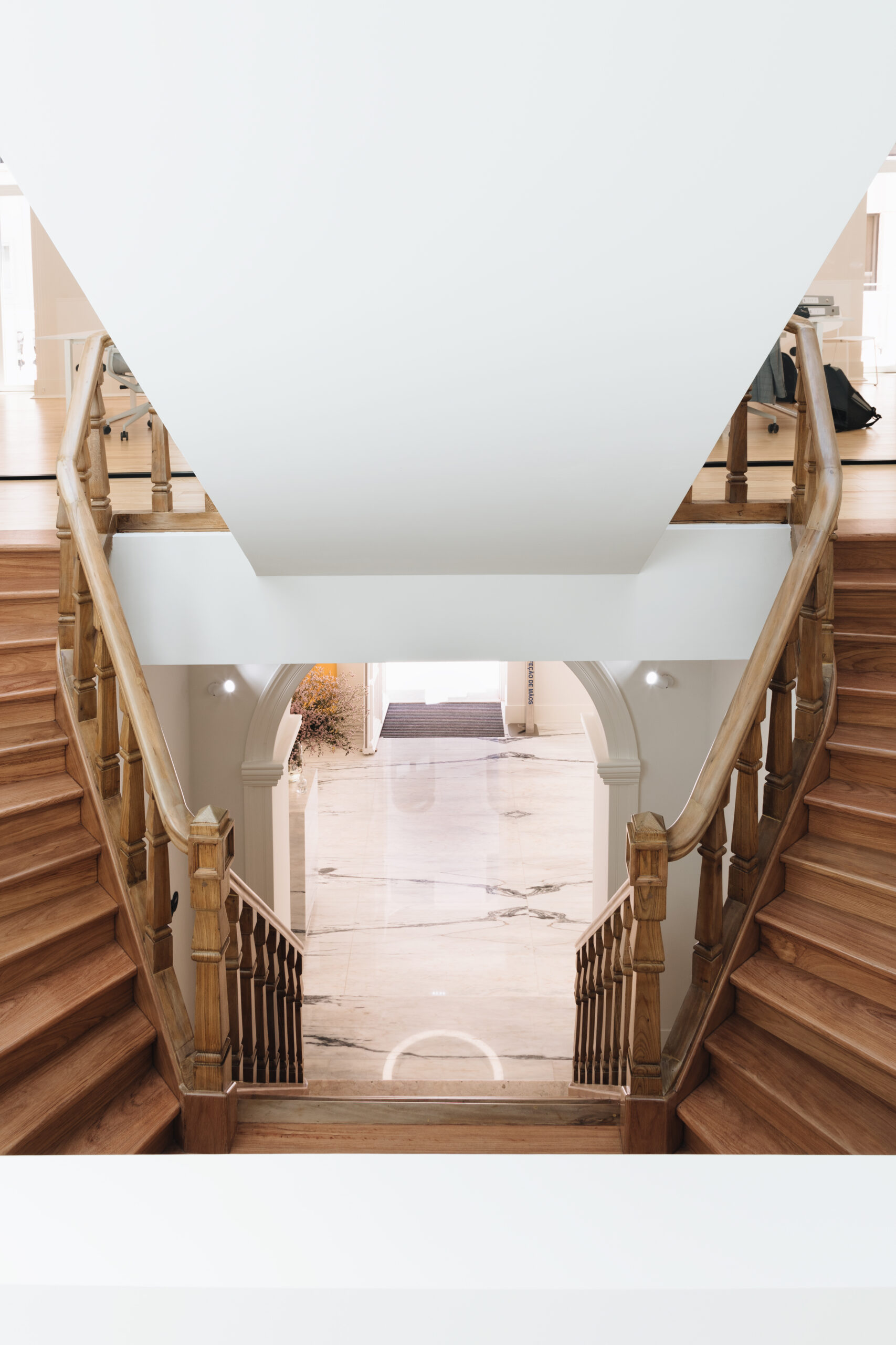
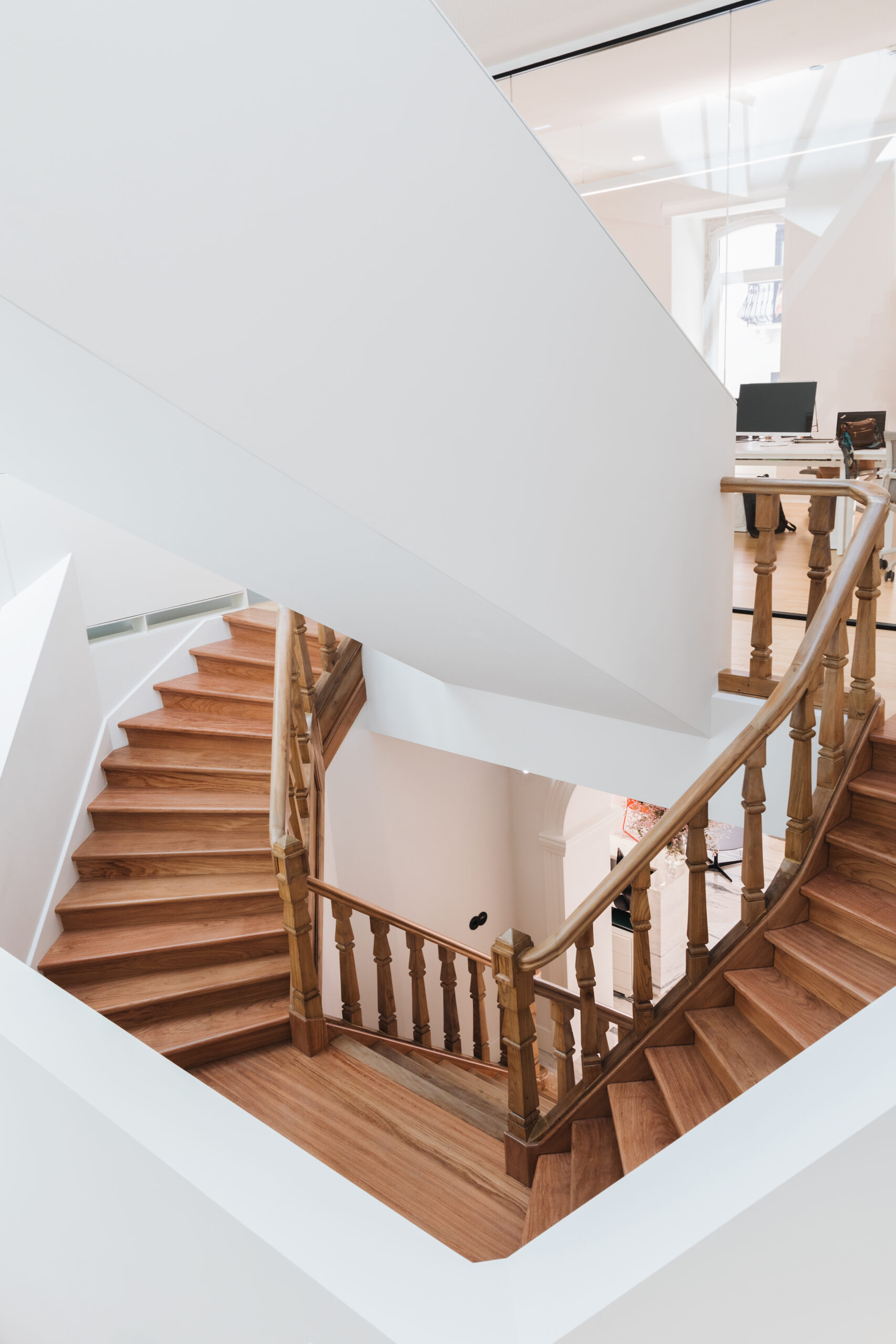
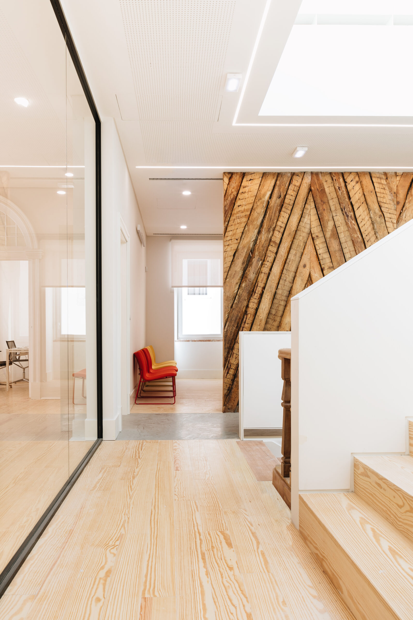
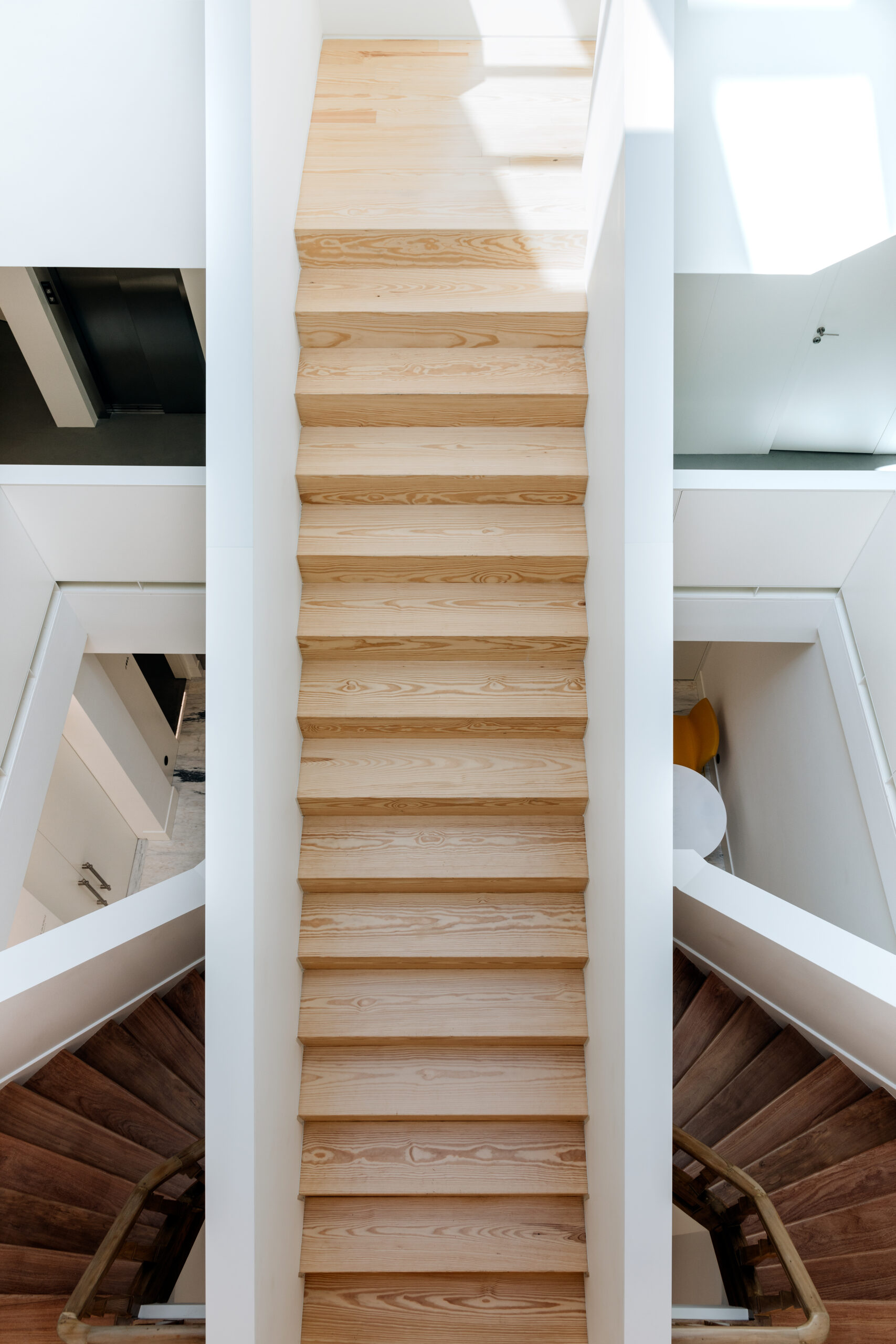
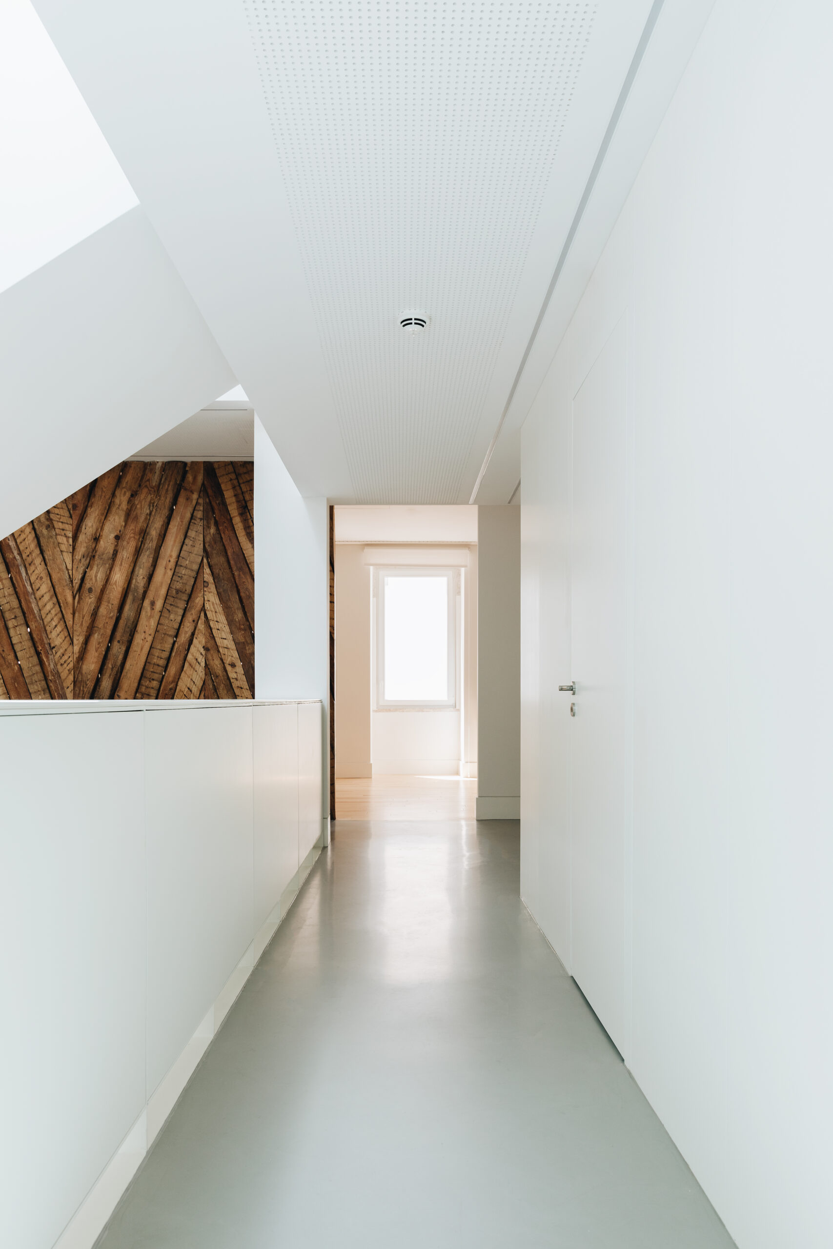
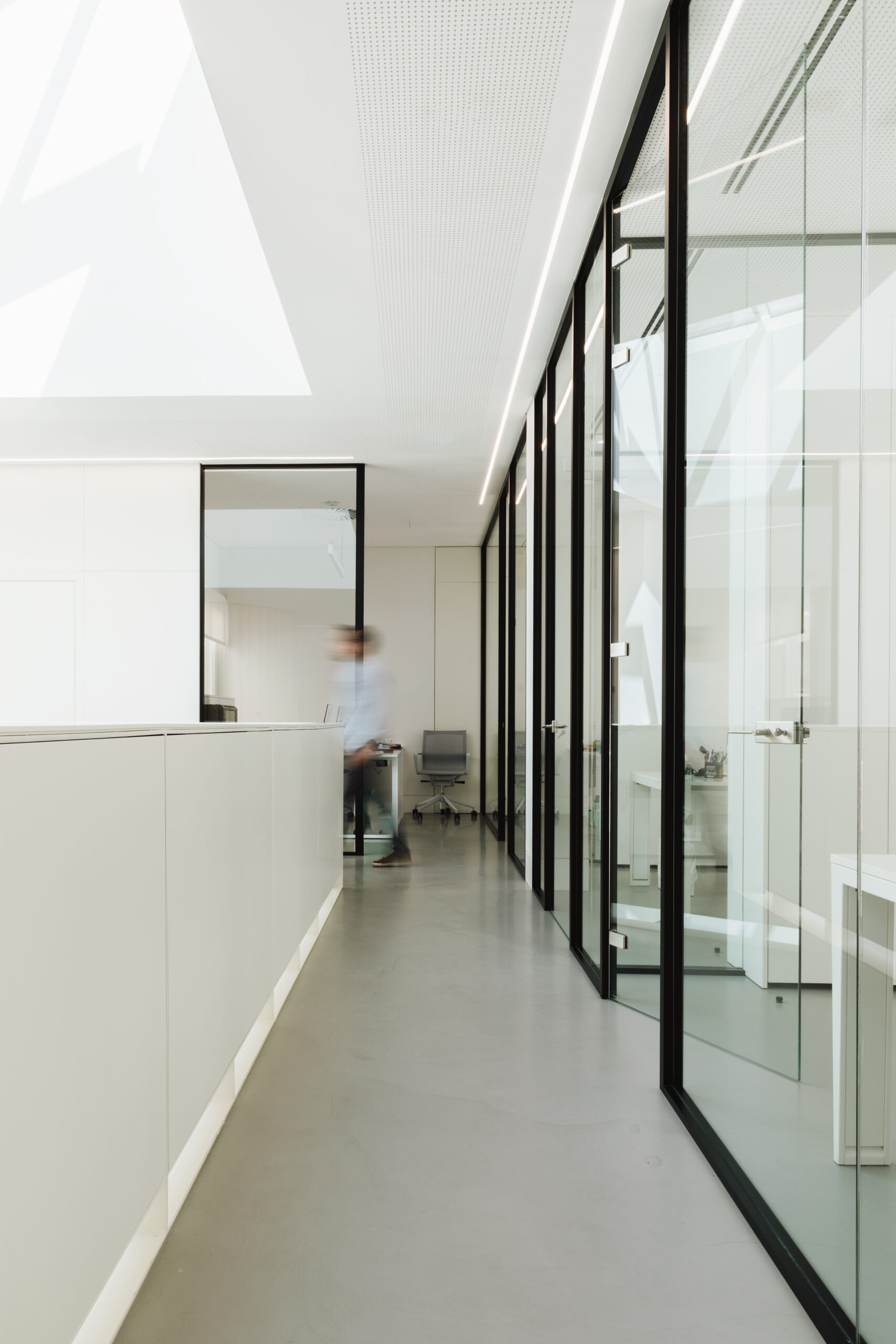
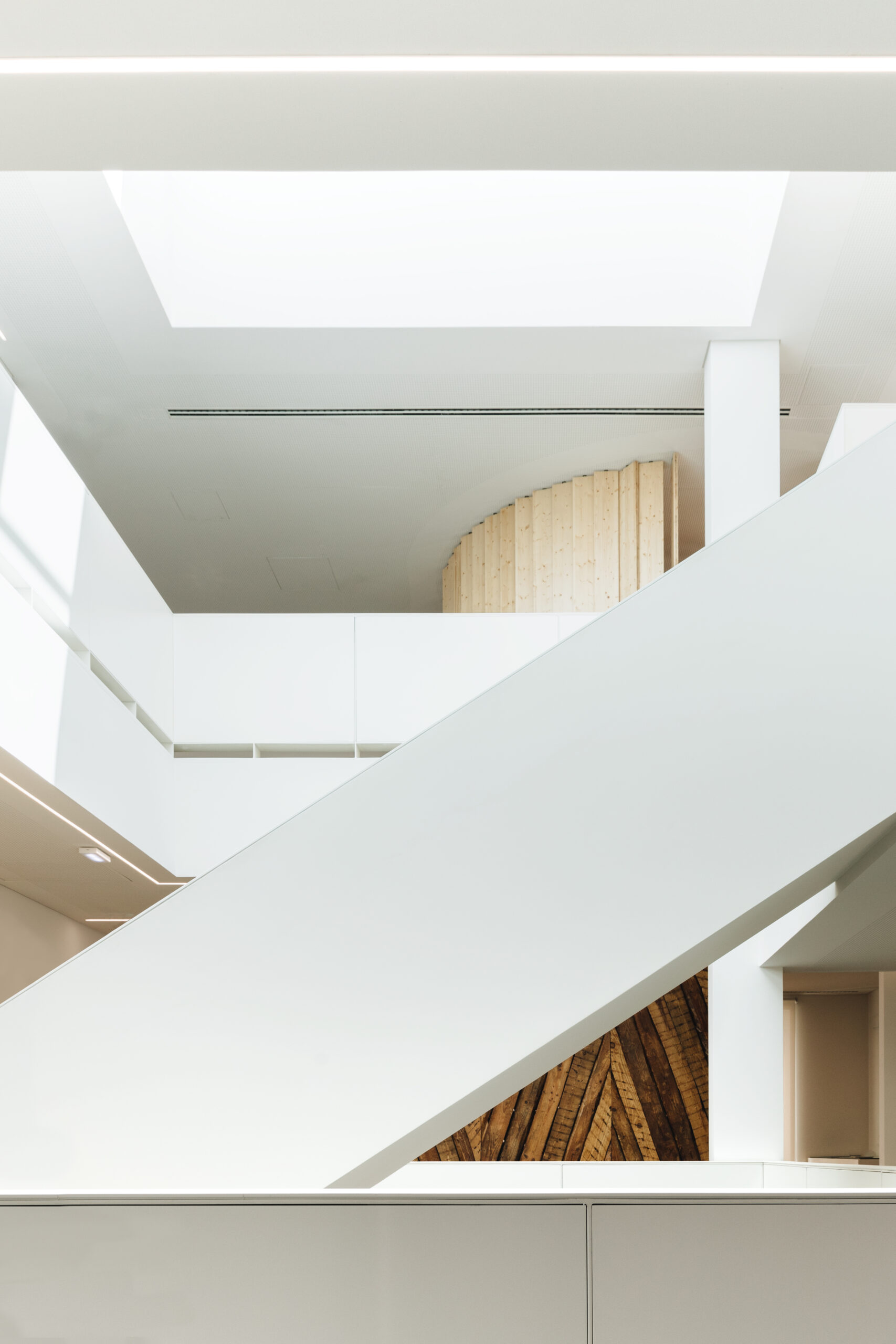
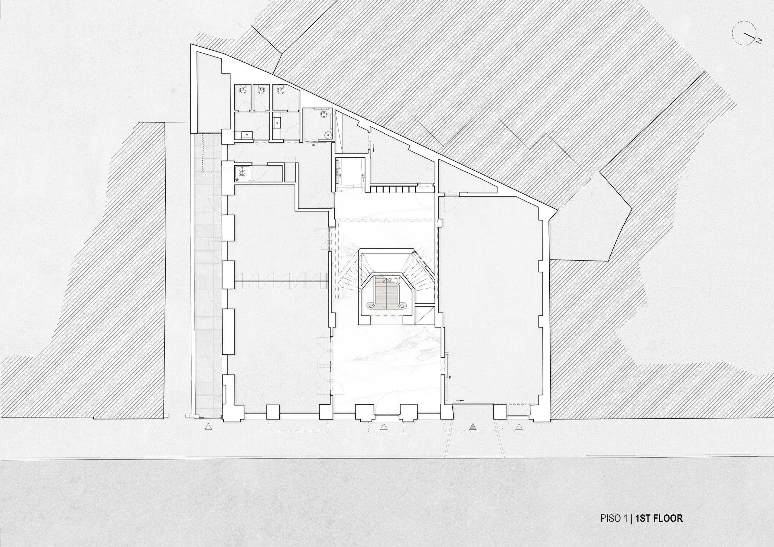
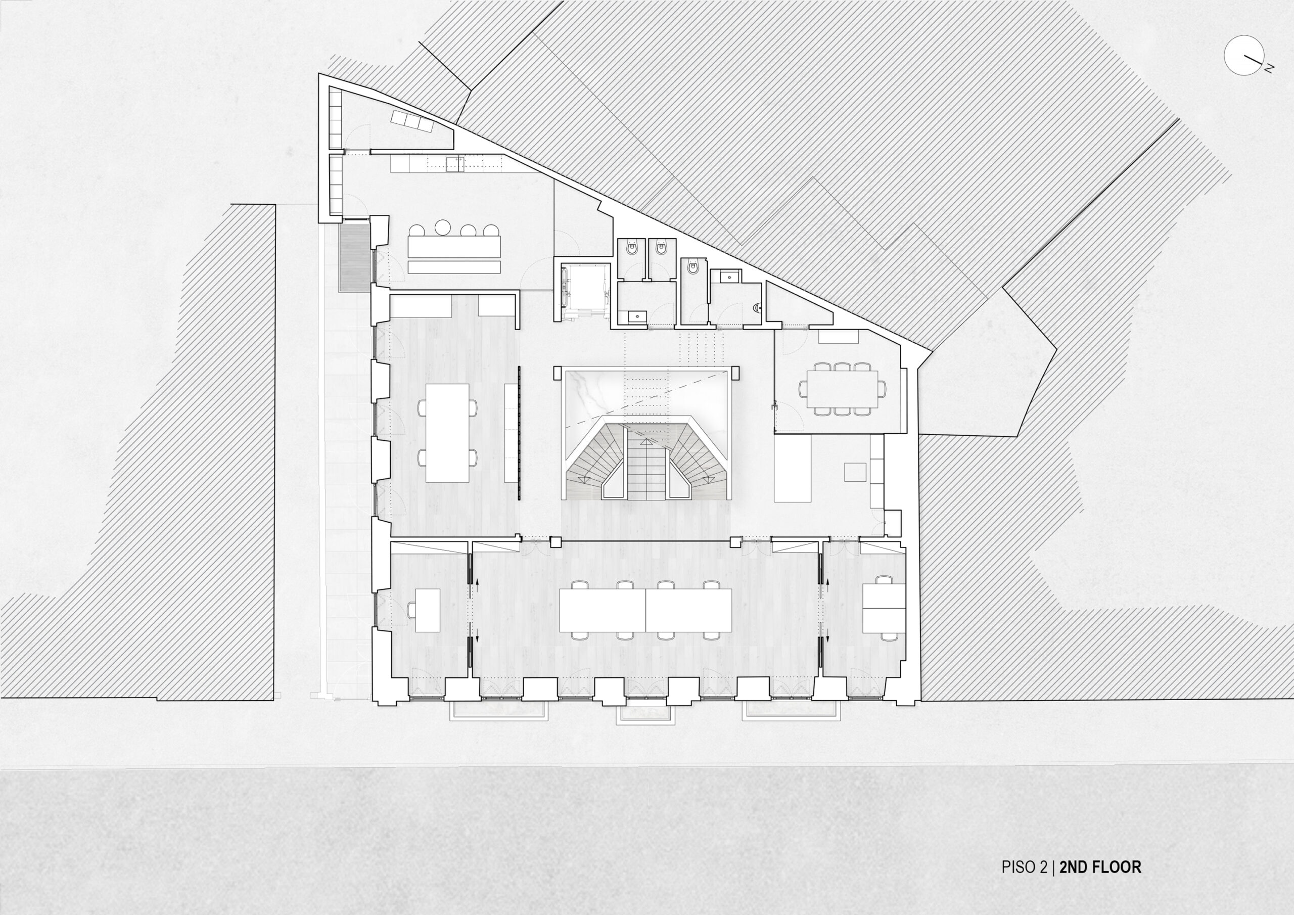
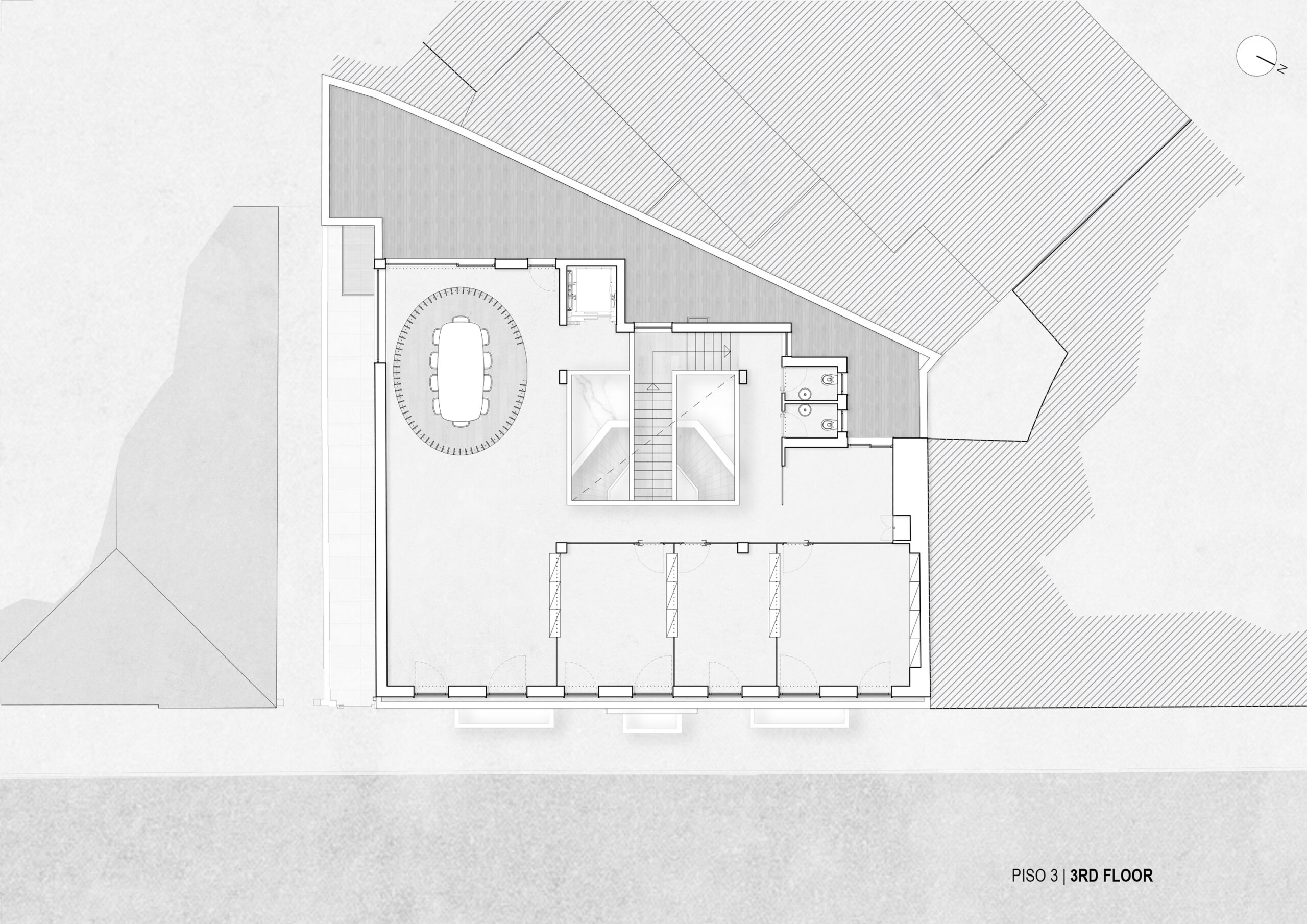
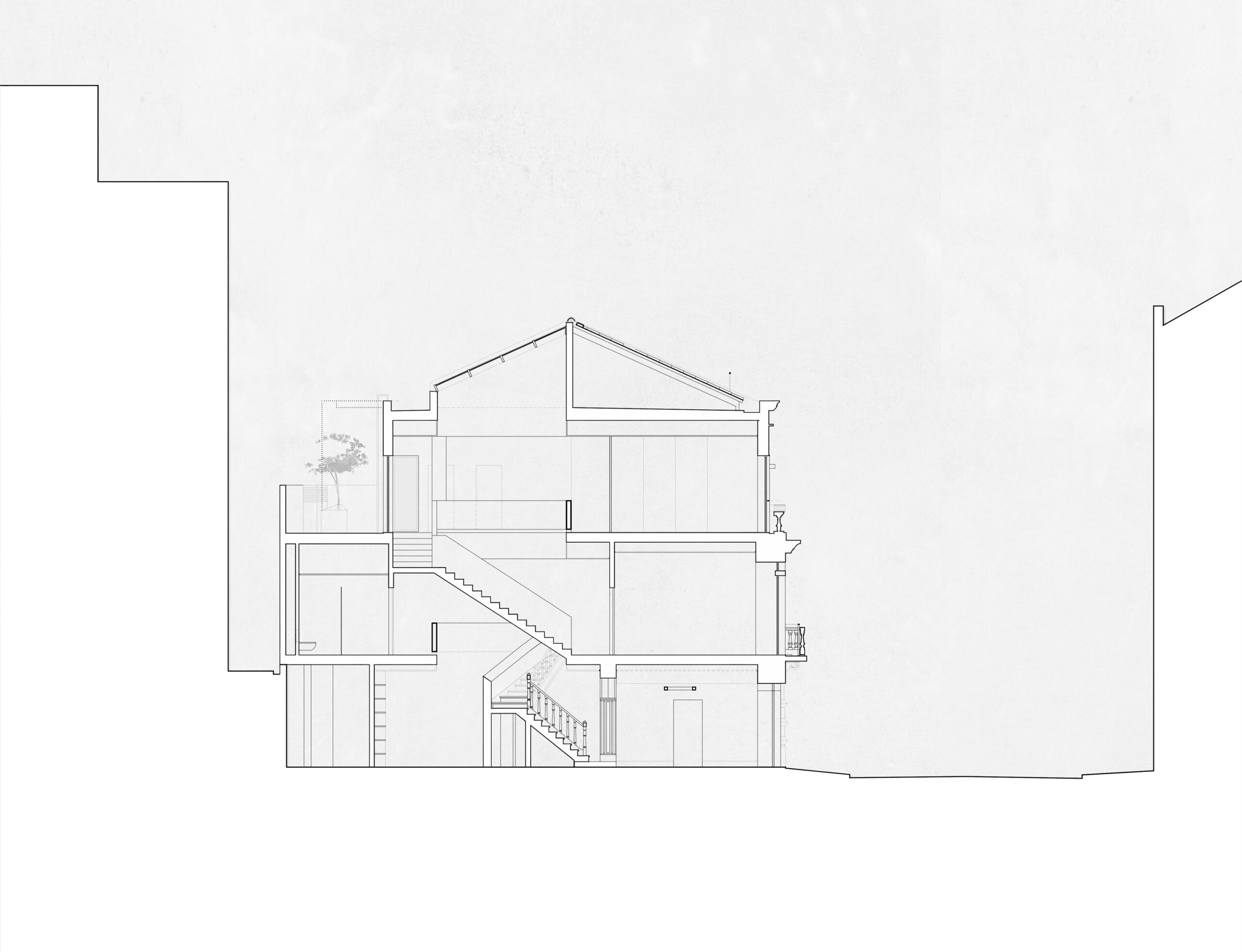
The functional and spatial organization of the building is based on the hollowed-out interior space, which is considered the core component of the entire proposal. The recreation of this space, with more suitable dimensions, allows natural light to traverse the volume and connect the interior spaces of the building. The distinctly vertical configuration of the voided element, with a triple-height space, is partially occupied by the stairs that connect the different floors and assume a sculptural role, revealed by visual permeability and zenithal light. The horizontal circulations on various floors are organized around this "voided solid" in overlapping rings. Visual alignments and contrasting elements along the paths create the promenade effect.
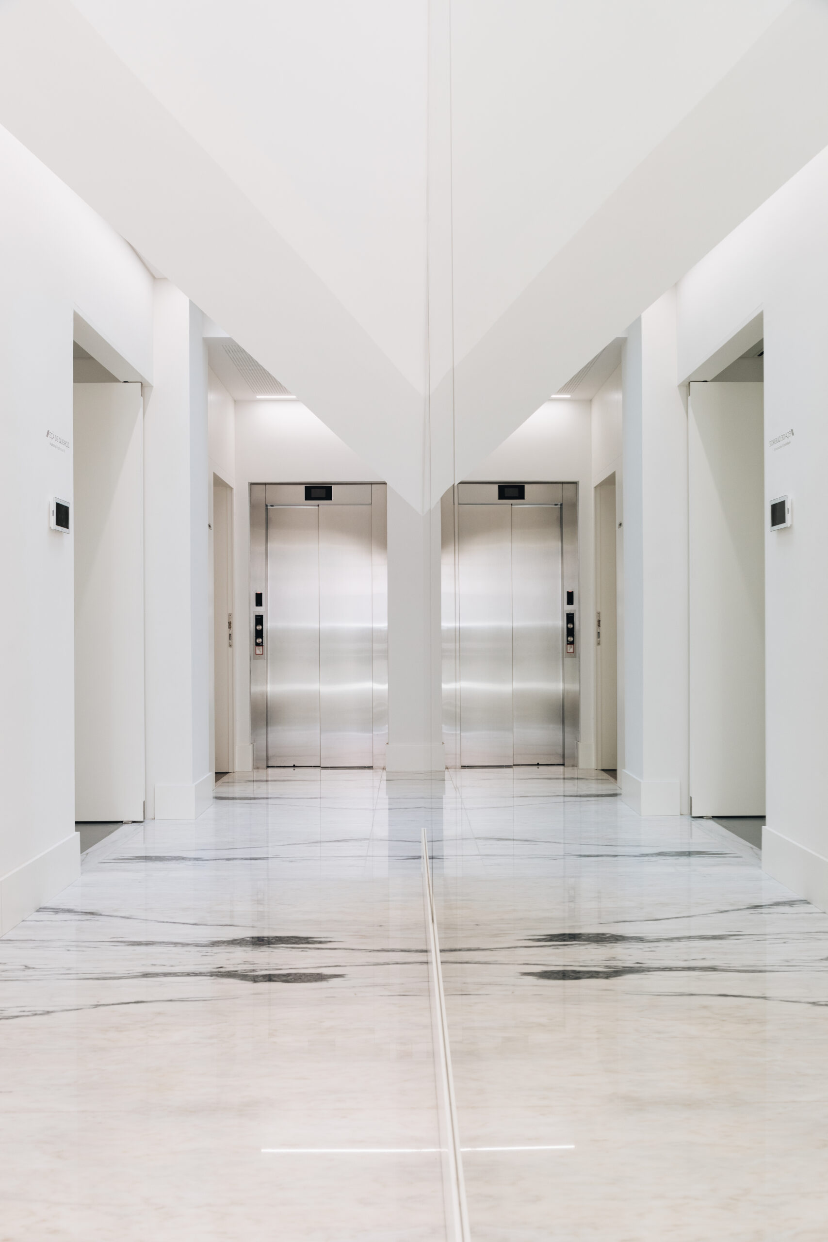
The light-colored tones and the use of glass elements allow the permeability of light and its direction and control.
The three floors have a functional hierarchy, stratified vertically, grouping spaces at different levels according to their uses.
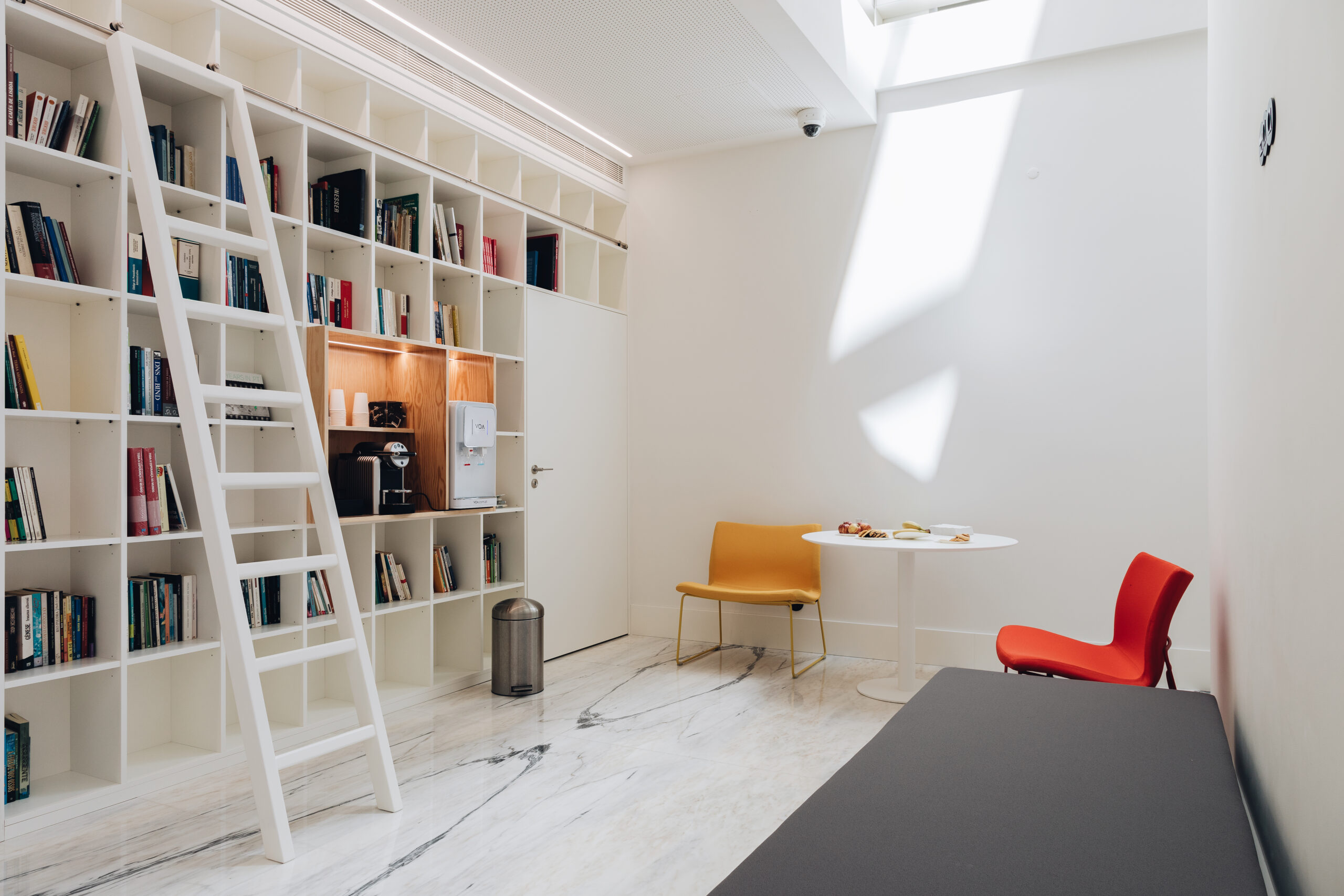
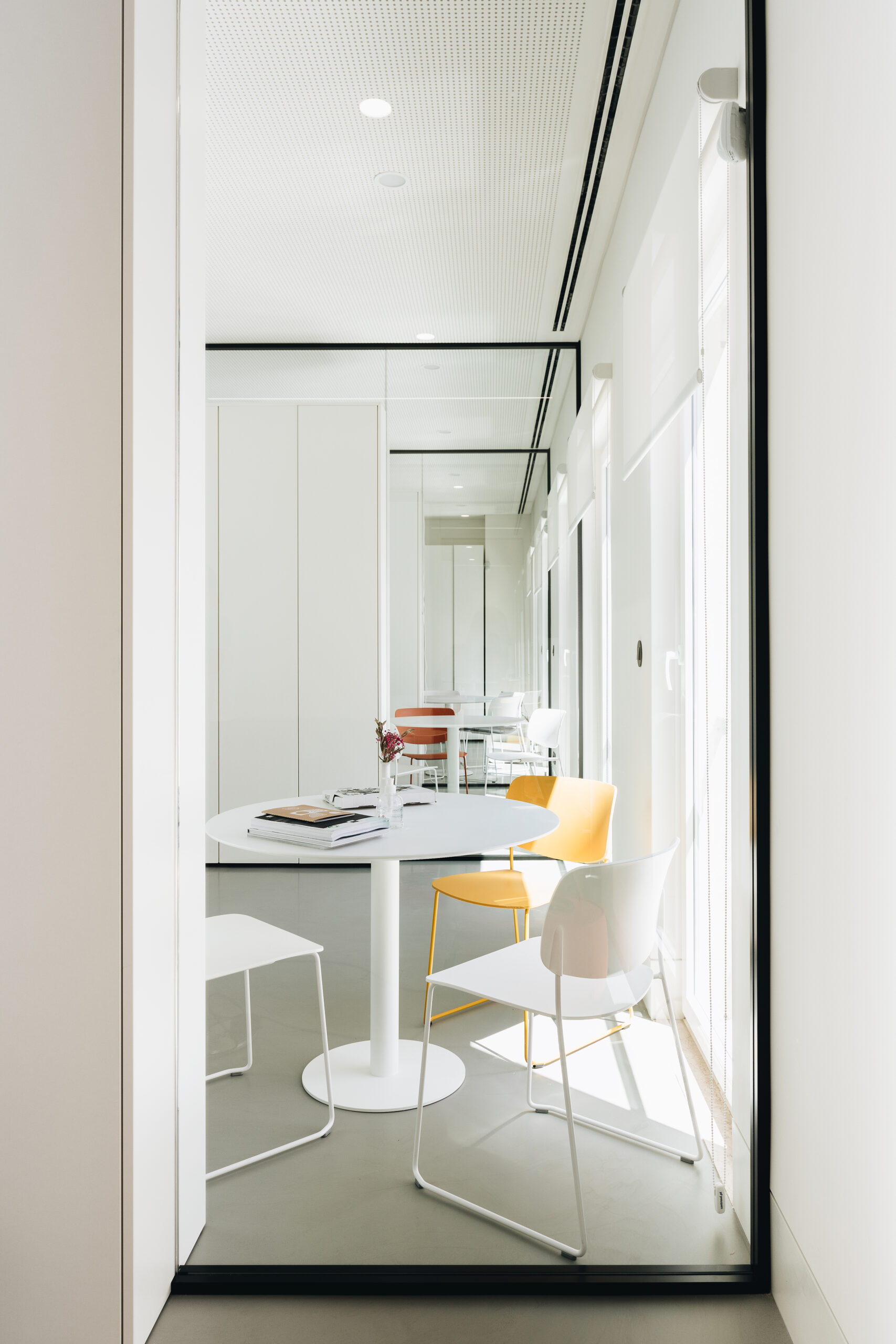
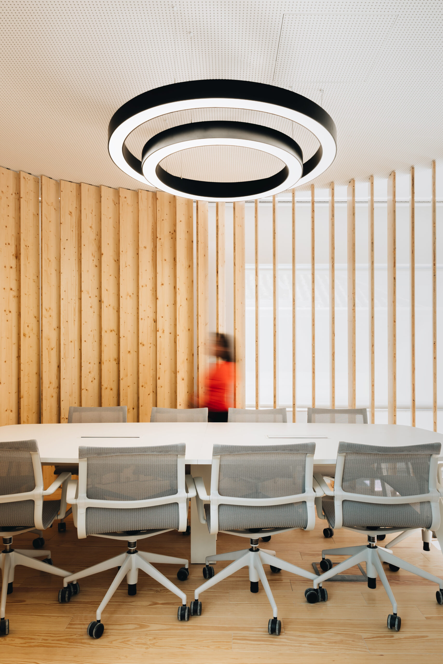
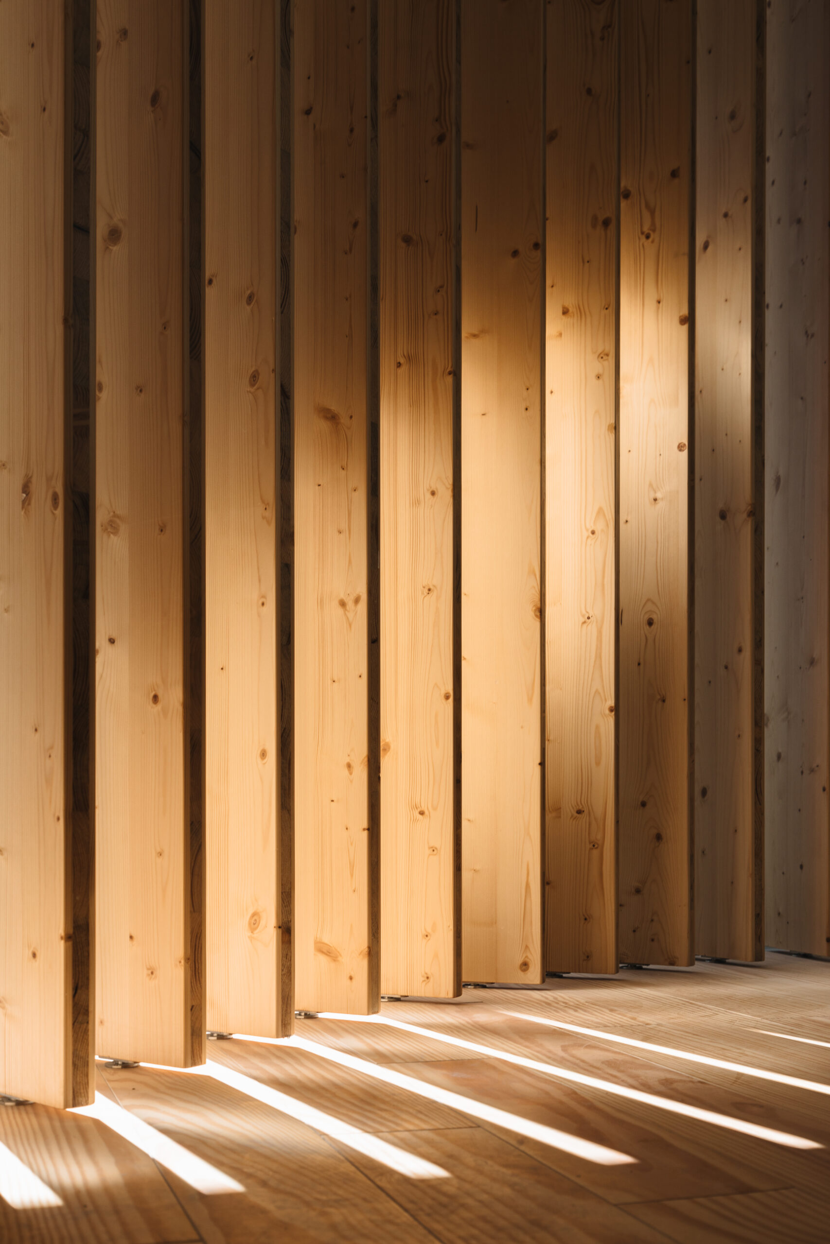
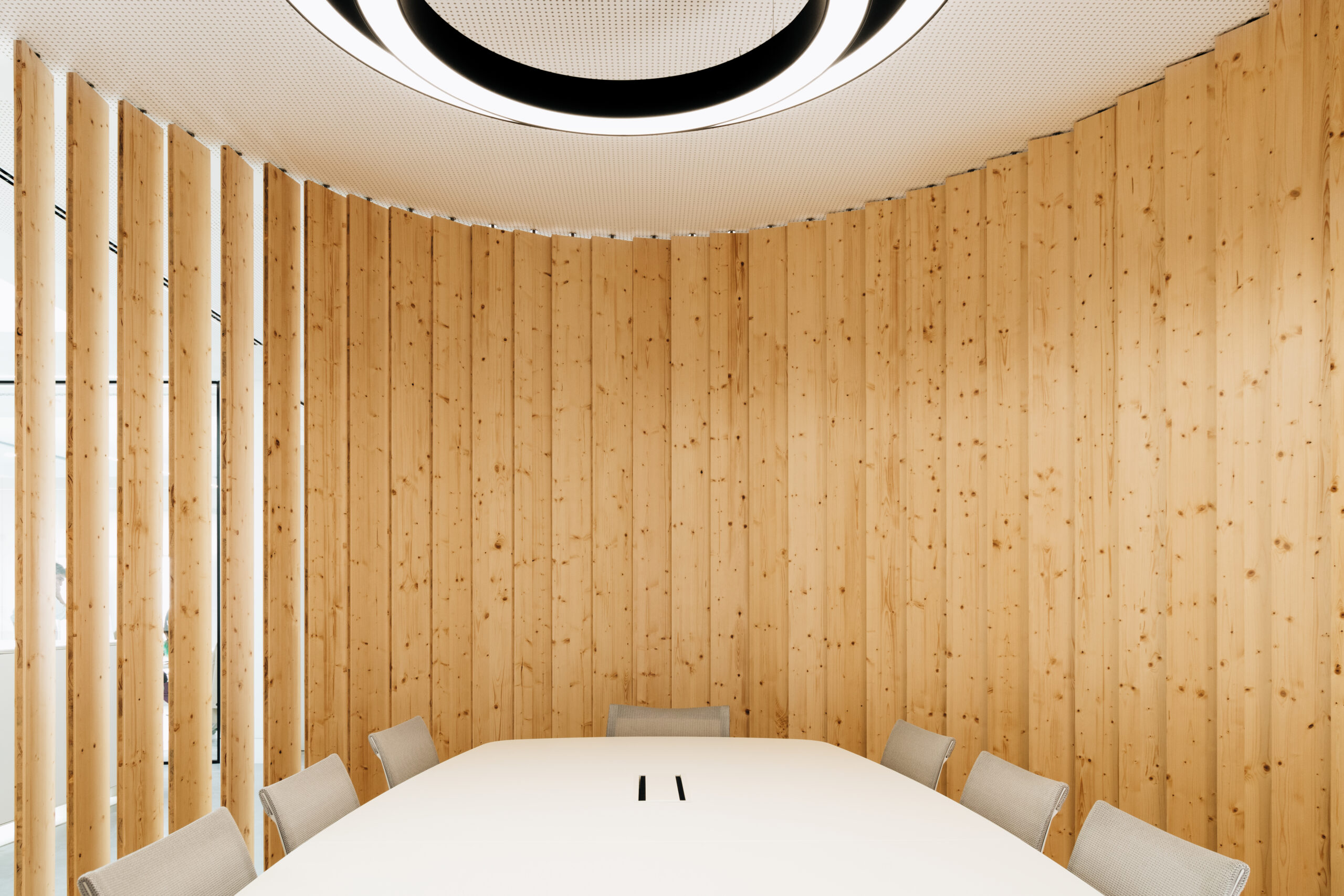
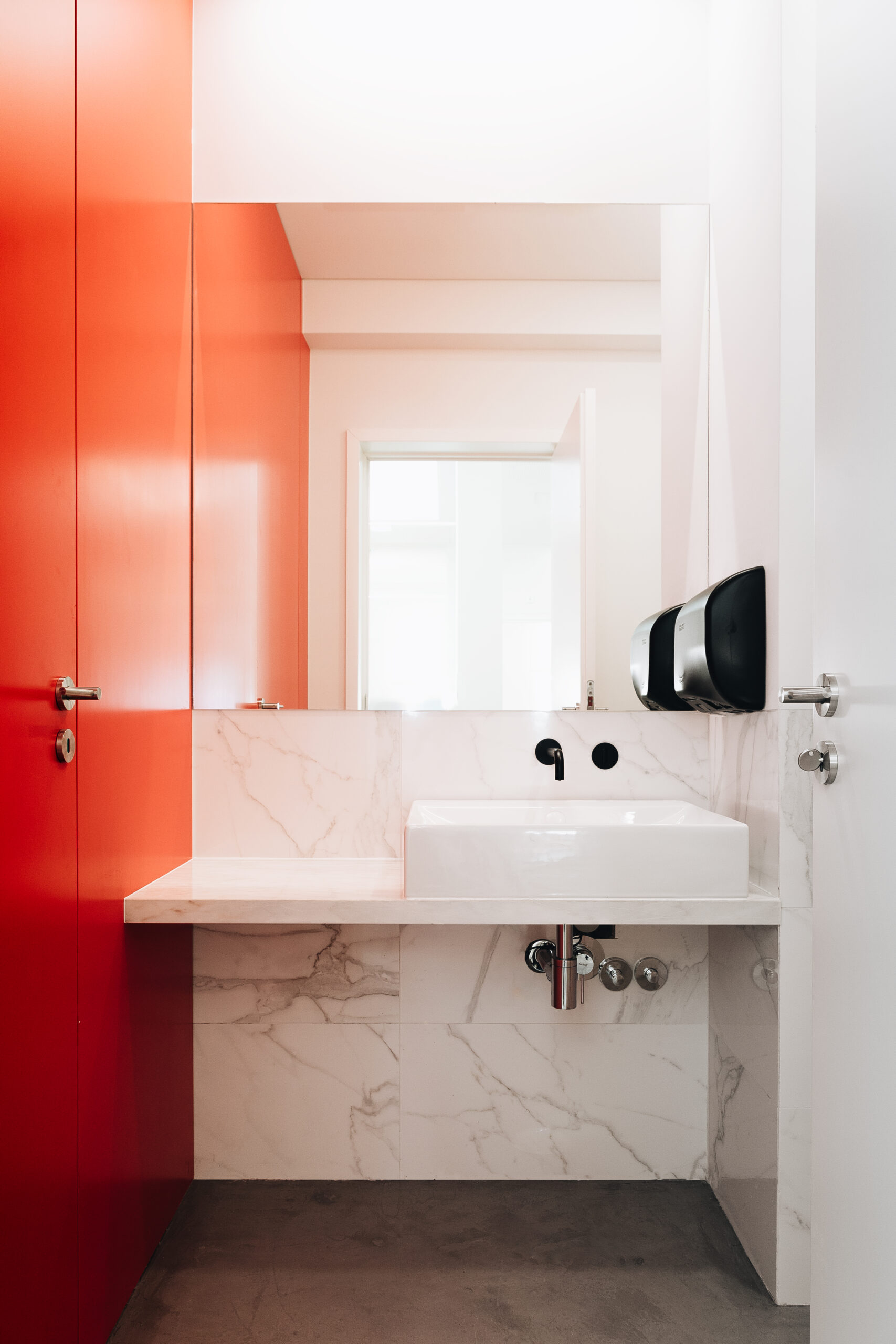
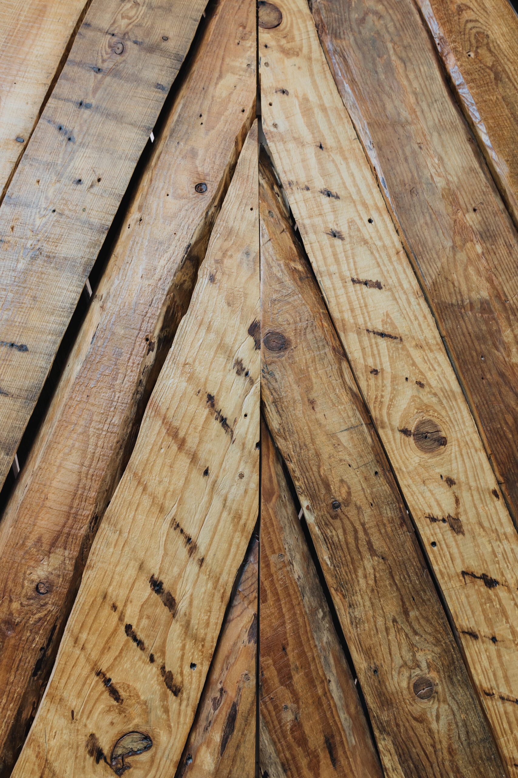
Regarding the choice of materials, the aim was to create a space that breathes on its own, minimizing potential visual noise. A palette of predominantly monochromatic and luminous tones was explored, with strategic accents of saturated colors. Thus, in addition to the warm color of wood in the preserved existing elements, a base palette of neutral, light colors, white, and occasional black was used in a dialogue between architecture and its appropriation/humanization. For example, light concrete was used as flooring in new spaces like the auditorium and pantry. Tiger skin marble was adopted as the entrance and library flooring.
The color here is used as a tool to break potential chromatic monotony, creating stimulating and creative spaces.
DRAWINGS
INFO
Location: Rua Eça de Queiroz, Lisboa
Status: Completed
Year: 2018
Client: DNS.PT
Area: 786.96m2
Topographic Survey: CGS
Architectural Survey: MA Arquitetos
Architecture: MA Arquitetos
Specialties: ENGLISPLAN, TRAÇO ABERTO, NICHOS URBANOS
Construction Work: PLANIREST
Supervision: MA Arquitetos e ENGLISHPLAN
Photography: Sofia Dourado
Status: Completed
Year: 2018
Client: DNS.PT
Area: 786.96m2
Topographic Survey: CGS
Architectural Survey: MA Arquitetos
Architecture: MA Arquitetos
Specialties: ENGLISPLAN, TRAÇO ABERTO, NICHOS URBANOS
Construction Work: PLANIREST
Supervision: MA Arquitetos e ENGLISHPLAN
Photography: Sofia Dourado

